Quick example of pure CSS power
Not that this is of much use it shows just how powerful CSS is!
There are a few spots that code like this can be applied as an alternative to using an image.
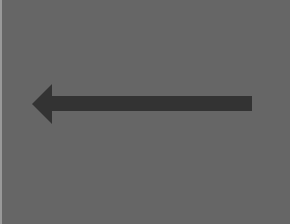
Did you know you can make an arrow out of pure CSS!
As seen in the post thumbnail, you can create arrows, diamonds and endless other shapes.
[clear]
Now this is not production code here, just an example.
Here is the rough CSS
|
1 2 3 4 5 6 7 8 9 10 11 12 13 14 15 16 17 18 19 20 21 22 23 |
.arrow-block { float: left; display: block; position: relative; width: 220px; height: auto; margin: 20px; } .horizontal { float: left; display: block; width: 200px; height: 15px; background: #333; } .arrow-left { float: left; border-right: 20px solid #333; border-top: 20px solid transparent; border-bottom: 20px solid transparent; width: 0px; margin: -12px 0 0 0; } |
And this is the HTML
|
1 2 3 |
<div class="arrow-block"> <div class="arrow-left"></div><div class="horizontal"></div> </div> |
The transparent borders are the key border-top: 20px solid transparent;.
They overwrite the colored part of the border.
You can see the code in action here in this demo.
Check out the source code for that page!
